TagGroupNew
A focusable list of tags with support for keyboard navigation, selection, and removal
Import
import { TagGroup } from '@heroui/react';Usage
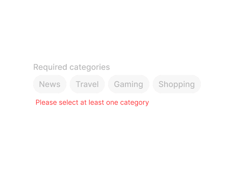
News
Travel
Gaming
Shopping
"use client";

import {PlanetEarth, Rocket, ShoppingBag, SquareArticle} from "@gravity-ui/icons";
import {Tag, TagGroup} from "@heroui/react";
Anatomy
import { TagGroup, Tag, Label, Description, ErrorMessage } from '@heroui/react';

export default () => (
  <TagGroup>
    <Label />
    <TagGroup.List>
      <Tag>
        <Tag.RemoveButton />
      </Tag>
    </TagGroup.List>
    <Description />
    <ErrorMessage />
  </TagGroup>
)
Sizes
Small
News
Travel
Gaming
Medium
News
Travel
Gaming
Large
News
Travel
Gaming
"use client";

import {Label, Tag, TagGroup} from "@heroui/react";

export function TagGroupSizes() {Variants
Default
News
Travel
Gaming
Surface
News
Travel
Gaming
Tags on surface component
On SurfaceTags on surface component
News
Travel
Gaming
"use client";

import {Description, Form, Label, ListBox, Select, Surface, Tag, TagGroup} from "@heroui/react";

export function TagGroupVariants() {Disabled
Some tags are disabled
Disabled TagsSome tags are disabled
Tags disabled via disabledKeys propNews
Travel
Gaming
Disabled KeysTags disabled via disabledKeys prop
News
Travel
Gaming
"use client";

import {Description, Label, Tag, TagGroup} from "@heroui/react";

export function TagGroupDisabled() {Selection Modes
Choose one category
Single SelectionChoose one category
Choose multiple categoriesNews
Travel
Gaming
Shopping
Multiple SelectionChoose multiple categories
News
Travel
Gaming
Shopping
"use client";

import type {Key} from "@heroui/react";

import {Description, Label, Tag, TagGroup} from "@heroui/react";Controlled
Selected: news, travel
Categories (controlled)Selected: news, travel
News
Travel
Gaming
Shopping
"use client";

import type {Key} from "@heroui/react";

import {Description, Label, Tag, TagGroup} from "@heroui/react";With Error Message
Select at least one category
AmenitiesSelect at least one category
Laundry
Fitness center
Parking
Swimming pool
Breakfast
"use client";

import type {Key} from "@heroui/react";

import {Description, ErrorMessage, Label, Tag, TagGroup} from "@heroui/react";With Prefix
Tags with icons
With IconsTags with icons
Tags with avatarsNews
Travel
Gaming
Shopping
With AvatarsTags with avatars
FFred
MMichael
JJane
"use client";

import {PlanetEarth, Rocket, ShoppingBag, SquareArticle} from "@gravity-ui/icons";
import {Avatar, Description, Label, Tag, TagGroup} from "@heroui/react";
With Remove Button
Click the X to remove tags
Default Remove ButtonClick the X to remove tags
News
Travel
Gaming
Shopping
Custom remove button with icon
Custom Remove ButtonCustom remove button with icon
React
Vue
Angular
Svelte
"use client";

import type {Key} from "@heroui/react";

import {CircleXmarkFill} from "@gravity-ui/icons";With List Data
Select team members for your project
Team MembersSelect team members for your project
FFred
MMichael
JJane
AAlice
BBob
CCharlie
Selected:
FFred
MMichael
"use client";

import type {Key} from "@heroui/react";

import {Avatar, Description, EmptyState, Label, Tag, TagGroup, useListData} from "@heroui/react";Styling
Passing Tailwind CSS classes
import { TagGroup, Tag, Label } from '@heroui/react';

function CustomTagGroup() {
  return (
    <TagGroup className="w-full">
      <Label>Categories</Label>
      <TagGroup.List className="gap-2">
        <Tag className="rounded-lg px-4 py-2 font-bold">
          Custom Styled
        </Tag>
      </TagGroup.List>
    </TagGroup>
  );
}
Customizing the component classes
To customize the TagGroup component classes, you can use the @layer components directive.
Learn more.
@layer components {
  .tag-group {
    @apply flex flex-col gap-2;
  }

  .tag-group__list {
    @apply flex flex-wrap gap-2;
  }

  .tag {
    @apply rounded-full px-3 py-1;
  }

  .tag__remove-button {
    @apply ml-1;
  }
}
HeroUI follows the BEM methodology to ensure component variants and states are reusable and easy to customize.
CSS Classes
The TagGroup component uses these CSS classes (View source styles and tag.css):
Base Classes
.tag-group- Base tag group container.tag-group__list- Container for the list of tags.tag- Base tag styles.tag__remove-button- Remove button trigger
Slot Classes
.tag-group [slot="description"]- Description slot styles.tag-group [slot="errorMessage"]- ErrorMessage slot styles
Size Classes
.tag--sm- Small size tag.tag--md- Medium size tag (default).tag--lg- Large size tag
Variant Classes
.tag--default- Default variant with field-on-background styling.tag--surface- Surface variant with surface background.tag--on-surface- On-surface variant for use on surface components.tag--on-form-field- On-form-field variant for use within form components
Modifier Classes
.tag__remove-button--on-surface- Remove button modifier for on-surface variant
State Classes
.tag[data-selected="true"]- Selected tag state.tag[data-disabled="true"]- Disabled tag state.tag[data-hovered="true"]- Hovered tag state.tag[data-pressed="true"]- Pressed tag state.tag[data-focus-visible="true"]- Focused tag state (keyboard focus)
Interactive States
The component supports both CSS pseudo-classes and data attributes for flexibility:
- Hover:
:hoveror[data-hovered="true"]on tag - Focus:
:focus-visibleor[data-focus-visible="true"]on tag - Pressed:
:activeor[data-pressed="true"]on tag - Selected:
[data-selected="true"]or[aria-selected="true"]on tag - Disabled:
:disabledor[data-disabled="true"]on tag
API Reference
TagGroup Props
| Prop | Type | Default | Description |
|---|---|---|---|
selectionMode | "none" | "single" | "multiple" | "none" | The type of selection that is allowed |
selectedKeys | Selection | - | The currently selected keys (controlled) |
defaultSelectedKeys | Selection | - | The initial selected keys (uncontrolled) |
onSelectionChange | (keys: Selection) => void | - | Handler called when the selection changes |
disabledKeys | Iterable<Key> | - | Keys of disabled tags |
isDisabled | boolean | - | Whether the tag group is disabled |
onRemove | (keys: Set<Key>) => void | - | Handler called when tags are removed |
size | "sm" | "md" | "lg" | "md" | Size of the tags in the group |
variant | "default" | "surface" | "on-surface" | "on-form-field" | "default" | Visual variant of the tags |
className | string | - | Additional CSS classes |
children | ReactNode | RenderFunction | - | TagGroup content or render function |
TagGroup.List Props
| Prop | Type | Default | Description |
|---|---|---|---|
items | Iterable<T> | - | The items to display in the tag list |
renderEmptyState | () => ReactNode | - | Function to render when the list is empty |
className | string | - | Additional CSS classes |
children | ReactNode | RenderFunction | - | TagList content or render function |
Tag Props
| Prop | Type | Default | Description |
|---|---|---|---|
id | Key | - | The unique identifier for the tag |
textValue | string | - | A string representation of the tag's content, used for accessibility |
isDisabled | boolean | - | Whether the tag is disabled |
className | string | - | Additional CSS classes |
children | ReactNode | RenderFunction | - | Tag content or render function |
Note: size, variant, isOnSurface, and isOnFormField are inherited from the parent TagGroup component and cannot be set directly on individual Tag components.
Tag.RemoveButton Props
| Prop | Type | Default | Description |
|---|---|---|---|
className | string | - | Additional CSS classes |
children | ReactNode | - | Custom remove button content (defaults to close icon) |
RenderProps
When using render functions with TagGroup.List, these values are provided:
| Prop | Type | Description |
|---|---|---|
isSelected | boolean | Whether the tag is selected |
isDisabled | boolean | Whether the tag is disabled |
isHovered | boolean | Whether the tag is hovered |
isPressed | boolean | Whether the tag is pressed |
isFocused | boolean | Whether the tag is focused |
isFocusVisible | boolean | Whether the tag has keyboard focus |