Checkbox
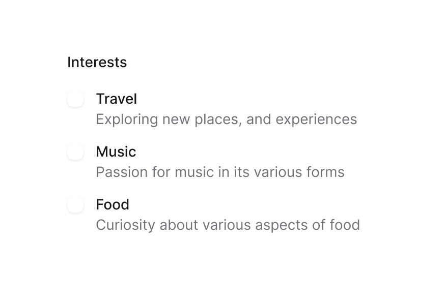
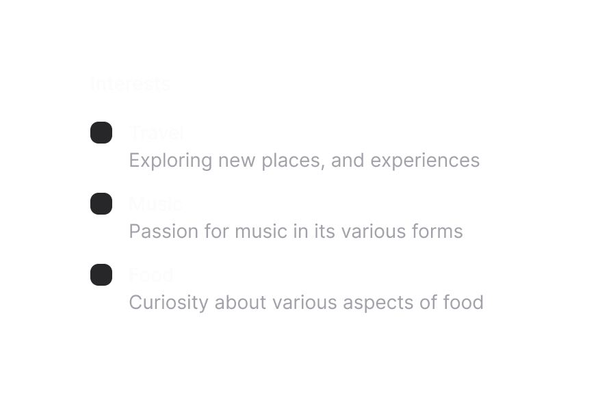
Checkboxes allow users to select multiple items from a list of individual items, or to mark one individual item as selected.
Import
import { Checkbox, Label } from '@heroui/react';Usage
import {Checkbox, Label} from "@heroui/react";

export function Basic() {
  return (
<div className="flex items-center gap-3">Anatomy
Import the Checkbox component and access all parts using dot notation.
import { Checkbox, Label, Description } from '@heroui/react';

export default () => (
  <Checkbox name="terms">
    <Checkbox.Control>
      <Checkbox.Indicator />
    </Checkbox.Control>
    <Checkbox.Content>
      <Label />
      <Description /> {/* Optional */}
    </Checkbox.Content>
  </Checkbox>
);
Disabled
This feature is coming soon
import {Checkbox, Description, Label} from "@heroui/react";

export function Disabled() {
  return (
<div className="flex gap-3">Default Selected
import {Checkbox, Label} from "@heroui/react";

export function DefaultSelected() {
  return (
<div className="flex items-center gap-3">Controlled
Status: Enabled
"use client";

import {Checkbox, Label} from "@heroui/react";
import {useState} from "react";
Indeterminate
Shows indeterminate state (dash icon)
"use client";

import {Checkbox, Description, Label} from "@heroui/react";
import {useState} from "react";
With Label
import {Checkbox, Label} from "@heroui/react";

export function WithLabel() {
  return (
<Checkbox id="label-marketing">With Description
Get notified when someone mentions you in a comment
import {Checkbox, Description, Label} from "@heroui/react";

export function WithDescription() {
  return (
<div className="flex gap-3">Render Props
"use client";

import {Checkbox, Description, Label} from "@heroui/react";

export function RenderProps() {Form Integration
"use client";

import {Button, Checkbox, Label} from "@heroui/react";
import React from "react";
Invalid
import {Checkbox, Description, Label} from "@heroui/react";

export function Invalid() {
  return (
<Checkbox isInvalid name="agreement">Custom Indicator
"use client";

import {Checkbox, Label} from "@heroui/react";

export function CustomIndicator() {Full Rounded
import {Checkbox, Label} from "@heroui/react";

export function FullRounded() {
  return (
<div className="flex flex-col gap-6">Styling
Passing Tailwind CSS classes
You can customize individual Checkbox components:
import { Checkbox, Label } from '@heroui/react';

function CustomCheckbox() {
  return (
    <Checkbox name="custom">
      <Checkbox.Control className="border-2 border-purple-500 data-[selected=true]:bg-purple-500">
        <Checkbox.Indicator className="text-white" />
      </Checkbox.Control>
      <Checkbox.Content>
        <Label>Custom Checkbox</Label>
      </Checkbox.Content>
    </Checkbox>
  );
}
Customizing the component classes
To customize the Checkbox component classes, you can use the @layer components directive.
Learn more.
@layer components {
  .checkbox {
    @apply inline-flex gap-3 items-center;
  }

  .checkbox__control {
    @apply size-5 border-2 border-gray-400 rounded data-[selected=true]:bg-blue-500 data-[selected=true]:border-blue-500;

    /* Animated background indicator */
    &::before {
      @apply bg-accent pointer-events-none absolute inset-0 z-0 origin-center scale-50 rounded-md opacity-0 content-[''];

      transition:
        scale 200ms linear,
        opacity 200ms linear,
        background-color 200ms ease-out;
    }

    /* Show indicator when selected */
    &[data-selected="true"]::before {
      @apply scale-100 opacity-100;
    }
  }

  .checkbox__indicator {
    @apply text-white;
  }

  .checkbox__content {
    @apply flex flex-col gap-1;
  }
}
HeroUI follows the BEM methodology to ensure component variants and states are reusable and easy to customize.
CSS Classes
The Checkbox component uses these CSS classes (View source styles):
.checkbox- Base checkbox container.checkbox__control- Checkbox control box.checkbox__indicator- Checkbox checkmark indicator.checkbox__content- Optional content container
Interactive States
The checkbox supports both CSS pseudo-classes and data attributes for flexibility:
- Selected:
[data-selected="true"]or[aria-checked="true"](shows checkmark and background color change) - Indeterminate:
[data-indeterminate="true"](shows indeterminate state with dash) - Invalid:
[data-invalid="true"]or[aria-invalid="true"](shows error state with danger colors) - Hover:
:hoveror[data-hovered="true"] - Focus:
:focus-visibleor[data-focus-visible="true"](shows focus ring) - Disabled:
:disabledor[aria-disabled="true"](reduced opacity, no pointer events) - Pressed:
:activeor[data-pressed="true"]
API Reference
Checkbox Props
Inherits from React Aria Checkbox.
| Prop | Type | Default | Description |
|---|---|---|---|
isSelected | boolean | false | Whether the checkbox is checked |
defaultSelected | boolean | false | Whether the checkbox is checked by default (uncontrolled) |
isIndeterminate | boolean | false | Whether the checkbox is in an indeterminate state |
isDisabled | boolean | false | Whether the checkbox is disabled |
isInvalid | boolean | false | Whether the checkbox is invalid |
isReadOnly | boolean | false | Whether the checkbox is read only |
isOnSurface | boolean | false | Whether the checkbox is displayed on a surface (affects styling) |
name | string | - | The name of the input element, used when submitting an HTML form |
value | string | - | The value of the input element, used when submitting an HTML form |
onChange | (isSelected: boolean) => void | - | Handler called when the checkbox value changes |
children | React.ReactNode | (values: CheckboxRenderProps) => React.ReactNode | - | Checkbox content or render prop |
CheckboxRenderProps
When using the render prop pattern, these values are provided:
| Prop | Type | Description |
|---|---|---|
isSelected | boolean | Whether the checkbox is currently checked |
isIndeterminate | boolean | Whether the checkbox is in an indeterminate state |
isHovered | boolean | Whether the checkbox is hovered |
isPressed | boolean | Whether the checkbox is currently pressed |
isFocused | boolean | Whether the checkbox is focused |
isFocusVisible | boolean | Whether the checkbox is keyboard focused |
isDisabled | boolean | Whether the checkbox is disabled |
isReadOnly | boolean | Whether the checkbox is read only |